Achieving color harmony - the experience of feeling balanced when surrounded by different colors found in nature on your walls, floors, rugs, fabrics - really everything in your environment - is key to your well-being and happiness. Do you want to feel serene? Energized? Relaxed?
Confusion, pressure, chaos, even ugly, can infiltrate a space with the wrong use of color. Following is a primer, explanations of the visual effect that is caused by the spectral composition of the light that’s emitted, transmitted or reflected by the objects in your space. In other words, what does color do, and why does it do that?

Stacey Lapuk, ASID
First things first. You can probably feel what a warm color is, yes? Think of the colors in nature, sunsets for example. Reds, oranges, yellows, yellow-toned greens, red-toned blues and red-toned violets. Warm colors feel welcoming and inviting.
Cool colors create a calming environment. How do you feel with a view of the ocean? In many cases, using a cool color in a small room can make the room feel larger. Think greens, blues, violets, blue-toned yellows, blue-toned oranges and blue-toned reds.
I usually begin my color explorations for a project by simply looking outside to nature for inspiration. We are genetically predispositioned to want to connect with our natural environment - it makes us happy. Integrating the principles of biophilic design with natural colors will create amazing interiors. Let your environment guide you to colors that are harmonious. No matter what colors you’re drawn to, you can usually find them outside, and can note how they relate to, and interact with other colors around them.
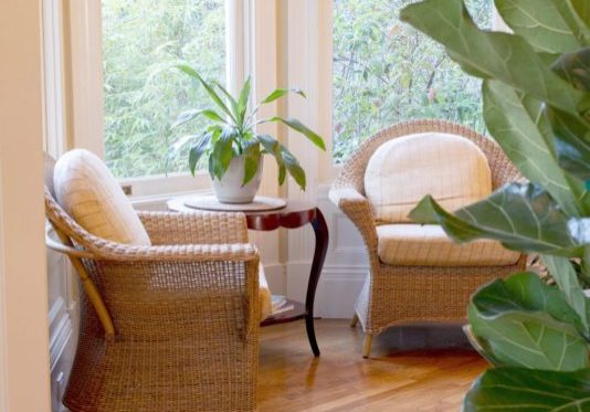
When you incorporate the colors you see out your windows into your interior design you are connecting the spaces. The separation between outdoors and in are mitigated through this use of color in nature, actually extending the feeling and visual size of the interior space.
Color Characteristics
Each color has 3 primary characteristics. Hue, describes the color of the spectrum - red, orange, yellow, green, blue and violet. When blended they produce an infinite number of colors. These are all colors found in nature. Think of amazing sunsets and rainbows.
Value is the lightness or darkness of a color. The more light a color reflects, the higher the value. Colors closer to white are of high value, those closer to black have lower value. Notice the difference in the natural colors of your shirt when you’re in the shade of a tree, then outside in the sun.
When a color is tinted, white is added and a higher value is achieved.
When a color is shaded, balck is added and a lower value is the result.
Chroma, intensity and saturation may feel like the same thing, but they’re actually not. At one end of the spectrum they look very similar: High chroma, high saturation and high intensity are pure - bold, vibrant and clear. As the color moves to low chroma, it’s toned down, soft and grayed. As the color moves to low intensity, it actually becomes black, and as the color moves to low saturation it gets lighter and lighter until it’s white.
Color Schemes
There are pros and cons to various color schemes. Imagine you’re looking at a color wheel as these are described.
An analogous color scheme speaks of three adjacent colors on the color wheel. One is dominant, the others are accents. Consider red, orange and yellow. Or green, blue and violet. You can combine tertiary colors as well. green, blue-green, and blue for example. The benefits of an analogous color scheme is they are simple to design, and are richer than a monochromatic scheme. However they can lack contrast. A solution is to infuse the analogous colors with a pop of a complimentary color, a white, or a black, to create complementary harmony.
In nature, you can experience an analogous color scheme by looking at a group of leaves. In the fall, you’ll see leaves of oranges, reds and yellows. The green from an evergreen tree provides the compliment.
A complementary harmonious color scheme uses colors opposite each other on the color wheel. It can create a space with contrast and stability, and works quite well when a warm natural color is used with a cool color, which can be very dramatic. A red rose with green leaves, colorful tulips, the cool blue of the ocean with a striking sunset of pinks and yellows. Higher contrast usually means more attention. The space can “grab” you. This scheme is harder to balance than monochromatic and analogous color schemes, especially when less saturated warm colors are paired with vibrant cool colors. Be careful.
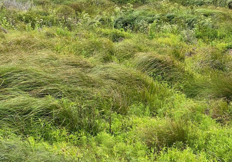
Monochromatic color schemes take advantage of variations in lightness and saturation of a single color. This look can be elegant, clean and soothing, reflecting the colors in nature. Imagine looking out into a forest of green. Or across a desert of sand. Most straight-forward to design, it’s easy to create a balanced and visually appealing space. The downside is it can lack color contrast, and is therefore not as vibrant as the other color schemes.
Physiological Effects Of Color
One of the fascinating aspects of color is how we perceive colors by its surroundings. For example the same color will appear lighter if it’s surrounded by a darker color, and darker when surrounded by a lighter color. The same color will appear more intense with a complimentary color, and more subdued with an analogous color. Always consider where your color will be. Remember as well, that light reflecting off an adjacent surface will affect your perception of the color. For example a light blue wall in a room with mahogany floors will look almost violet. A room full of sunlight will lighten all colors, and as the sun moves and creates shadows in the room the darker areas will recede, sometimes appearing mysterious.
Our appetites are also affected by colors in nature. Blue and black foods were poisonous, so we tend to avoid blue food (other than blueberries, of course!). Therefore blue is actually an appetite suppressant.
Our natural pleasing response to bright, warm colors increases our appetite, and our pace. Notice how most fast-food restaurants are in warmer colors. They want you in, eating and leaving as quickly as possible.
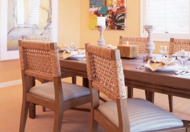
Green has been shown to increase attention span and concentration levels, which makes it a wonderful choice for a home office. For a calm, rich dining experience, consider toned yellows and reds - warm, inviting and open to conversation.
Chromatherapy
Color in nature has been shown to have therapeutic effects on specific energy centers of our bodies. Blue and purple offer tranquility, green and orange are healing colors and sooth muscles, and red and yellow help us energize and wake-up.
Life Stages and Color
Our experience of sophistication - our experiences and style give clues to how color affects us. In general, as children we’re attracted to warm, bright colors. Preschoolers up to around age 5 favor bright reds and purples. 5 - 9 year olds like bright yellows, purples and blues. Bright colors are happy, dark colors are sad.
As teenagers, we like off-beat combinations and color effects. Think translucent, pearlessence and metallics. Adults tend to prefer blues. Interestingly, adult women prefer blue-based colors, and adult men like yellow-based tints.
Cultural influences, history and technology, global fusion, politics, sustainability and many more aspects of the use and understanding of color also guide us in our color designs for living today. The prisms of our lives.
Interestingly, according to some studies blue is the most loved color of all, throughout all cultures and across all continents. Blue sky, blue water. Something to consider.
If you’d like to learn more about harmonizing your home's interior with your environment through the proper use of color, please don't hesitate to contact me today.
Stacey Lapuk, ASID
Stacey Lapuk, ASID is celebrating her 30th year with her firm. Named “One of America’s Ten Designers To Watch” by Design Times Magazine, one of the “Top 100 Interior Designer in North America” by Blink Art Resources, and the winner of multiple national design awards. Her goal is simple: To co-create with her clients the home of their dreams with responsive and comprehensive solutions, and timeless, beautiful results.
Her full service firm attracts clients desiring the finest workmanship, materials and custom design. Facets of work include partnering with architects on new construction, remodels, kitchen design and bath design, color consultation, custom furniture, flooring, area carpets, wall and window treatments, lighting design, art procurement and antique acquisition. Service areas include but are not limited to Marin County, San Francisco, Napa, Sonoma, Ross, Kentfield, Belvedere, Tiburon, San Rafael, and Pacific Heights.
Phone: (707) 658-2670 | Mobile: (415) 320-0077 | Email: stacey@staceylapukinteriors.com
www.staceylapukinteriors.com